This article first appeared in the From the Editor column of the Christian Research Journal, volume 28, number 2 (2005). For more information about the Christian Research Journal, click here.
We sometimes receive comments or questions about an illustration, photo, or layout that we’ve used with a feature article in the Journal, so I thought it would be interesting and beneficial to explain our design process and the reasoning behind it. This will, hopefully, provide some insight into the Journal’s artistic vision and motivation.
The Journal’s design objective, in one sentence, is to reflect visually the content and themes of the articles we publish. The mission of the Journal is to equip readers for an informed response to new religious movements and contemporary apologetics issues. This is a rather unique task in the periodical publishing world, and our articles are unique as well. They touch on a broad range of topics and often deal with provocative issues. They expose things and explain things. Sometimes they describe a battle of ideas and sometimes they engage in it. Occasionally, by exposing non-Christian beliefs and practices, they make some people uncomfortable. They are (hopefully) always stimulating, but not always soothing. They challenge believers and unbelievers to think about what is below the surface and beyond the emotional. The Journal’s design supports the articles.
Our design process begins with an art-planning meeting that includes the Journal editors and our art director. Having read the articles in the upcoming issue, we bring our various ideas to the table for discussion. We discuss sometimes up to a dozen different artwork concepts or variations of those concepts for each article. An idea may be shot down for a number of reasons, but usually because it doesn’t strike us as adequately representing the tone or point of the article. We disqualify ideas that fail to meet the criteria below and only accept an idea when we agree that it meets those criteria.
The criteria we consider when we discuss art ideas is threefold. First, the artwork must reflect or represent the argument, approach, or attitude of the article it accompanies. If an article is provocative, for example, then we consider artwork that is provocative, that is, it provokes appropriate thought or reaction. We don’t shy away from using artwork that is provocative in that sense, but we never try to be provocative simply for its own sake, just as our articles are sometimes controversial, but never simply to be controversial. We want the artwork to reinforce or reflect the truth that is communicated in an article, whether that truth is beautiful or ugly, comforting or disturbing.
Second, we want the artwork for an article to “say” something in its own right, even though art is not propositional in the same way that an article is propositional. In other words, we don’t want the artwork to just be page filler; rather, we want it to add something valuable to the experience of reading the article. We understand that the primary focus of the Journal is the content of the articles, but we also think that art is a legitimate and powerful medium of communication that is often misused. It is important, therefore, that the artwork we use is good art; in other words, it has integrity in its content and its craftsmanship. Artwork for a magazine like the Journal is not decoration; it is a form of visual journalism. The magazine staff, and the art director in particular, belong to professional organizations such as the Evangelical Press Association, the Society of Publication Designers, and the American Institute for Graphic Arts in order to gain insight, instruction, and critique from our peers. This interaction helps us to produce work that has integrity.
Third, we want the Journal’s artwork to attract Christians and non-Christians to read the articles. We have become a visually oriented society, therefore, if the artwork is interesting there is a greater chance that someone will read our articles. It’s that simple. In trying to meet this objective, however, we do not necessarily try to please everyone and offend no one. That is impossible. Our readers’ range of tastes and sensibilities is just too broad. Just as we have to assume certain things about our readers’ abilities to understand our articles, we also have to assume certain things about their abilities to understand our artwork. In this regard, it is interesting that non-Christians have responded very positively to the Journal’s design, often remarking that they are surprised by the high-quality art and the innovative design in a religious publication.
In the next step of our design process, our art director draws a few rough sketches of each of the artwork concepts we have approved. After the editor-in-chief approves the sketches, the art director then selects an illustrator (or a photographer) in each instance whose style of work is appropriate for the concept. For example, if the art concept emphasizes a truth found in the article, then he may select an illustrator who is capable of a “realistic” or “earthy” style; whereas if the concept emphasizes error or speculation, then he may select an artist with a “cartoonish” or “dreamlike” style. The style helps to convey whether the artwork is portraying truth or error. Once the right illustrator has been selected for an article, the art director sends him or her the rough sketch and the two collaborate to ensure that the final artwork conveys the idea correctly. (For a fuller explanation of how and why we used a particular style in one instance, see Dwayne Cogdill and Elliot Miller’s reply to a reader in the Response column in vol.22, no.3.) Our design concepts don’t always require custom artwork. Sometimes they call for stock artwork, such as a photo of a famous painting or of a historical person or event.
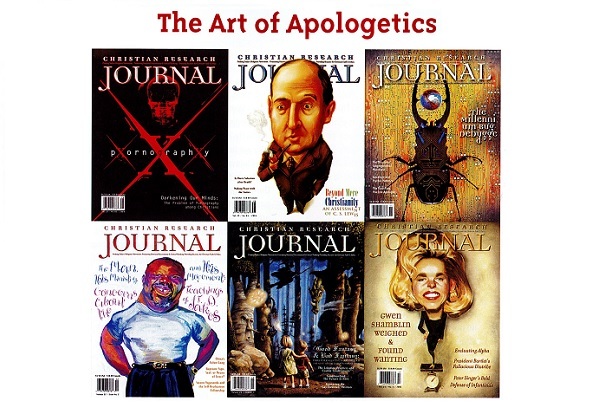
In either case, the illustrations and photos are just one aspect of the magazine design. The art director also selects the appropriate text, typestyle, layout, and color pallet to convey the article concepts. These elements create a richer visual experience for the reader than would page after page of text alone. The art director strives create a “tone of voice” in the artwork and layout of an article. Just as words can convey different things depending on the tone of voice of the one speaking, so can artwork. When the Journal published an article on fantasy literature, for example, we wanted to help readers appreciate this type of literature. We were, therefore, pleased to receive comments that the article was “beautiful.” Similarly, when we published an article on atheism we wanted to help readers “see” how ungrounded our existence would be if there were no God. We were again pleased to receive comments from readers saying that the article made them “uncomfortable” and that they did not like the look of it. These instances show how the design can communicate the content of an article in a holistic and experiential way.
In trying to meet our design objectives we always carefully consider the point of view of our readers: Does the artwork implicitly say something we don’t want it to say or that is untrue? Might it be misunderstood by most people? Is it unnecessarily provocative or offensive to the majority of our readers or to a particular group? We try very hard to balance telling the truth with showing good taste and consideration, which we realize is defined differently by different cultures even within the United States. Recently we ran an article about pornography. We knew that showing pornography, or even the covers of pornographic magazines, would have been in poor taste and unnecessary, as people can understand what is being discussed without having to see the graphic details. We had to think creatively about this and decided to focus, instead, on the “deadly effects” of pornography. We portrayed this concept with skeletons and a layout that alluded to the skull and crossbones found on poison warning labels. Combined with the colors used, this layout was very bold. Some readers said that they felt the article was “dark” and emotional. That is the experience we wanted readers to have while reading the article. The lie of Satan is that pornography is harmless; the truth in the article is that pornography is deadly and overwhelming.
Finally, we want to mention that the Journal has been awarded 30 international design awards in the past five years. The Journal has also appeared in design magazines and in several books on magazine design, and examples from the Journal have been included in art exhibitions in New York and Europe. This past year an art school in Oklahoma invited our art director, Dwayne Cogdill, to produce an entire exhibit consisting of design from the Journal. During his presentation, Dwayne was able to speak to almost 250 students about the truth of the gospel. They listened to what he had to say because they respected the integrity of his work in the Journal. Artwork and design is indeed integral to the task of apologetics in our culture.


